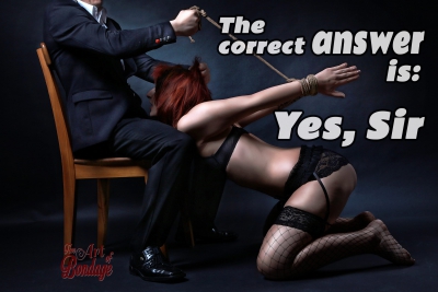
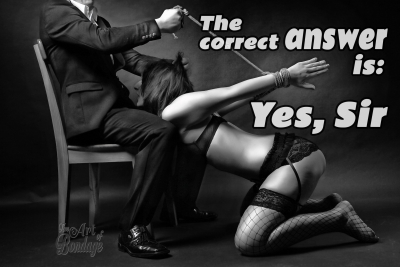
Bondage art – best color and tonal effects

This book is a lot more of work than expected – it´s not only about tying girls and take some photos. The part behind the scenes with photoshop to get much more out of the images is also very time consuming. When a picture is finished, I often have about 3 to 10 different styles of it and I really can´t say which one is the best of it…
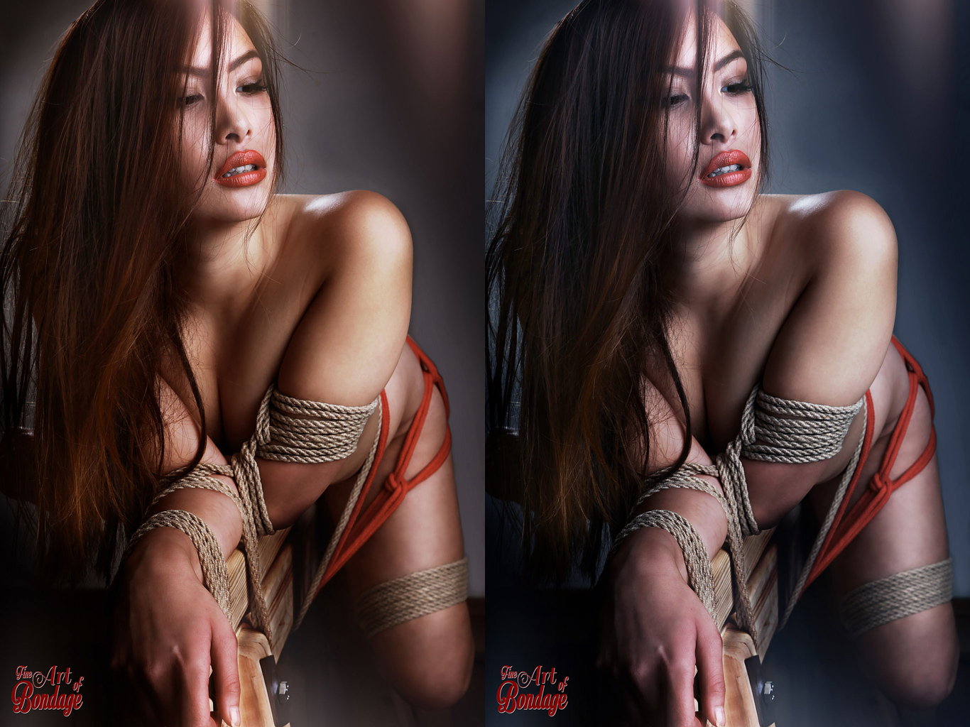
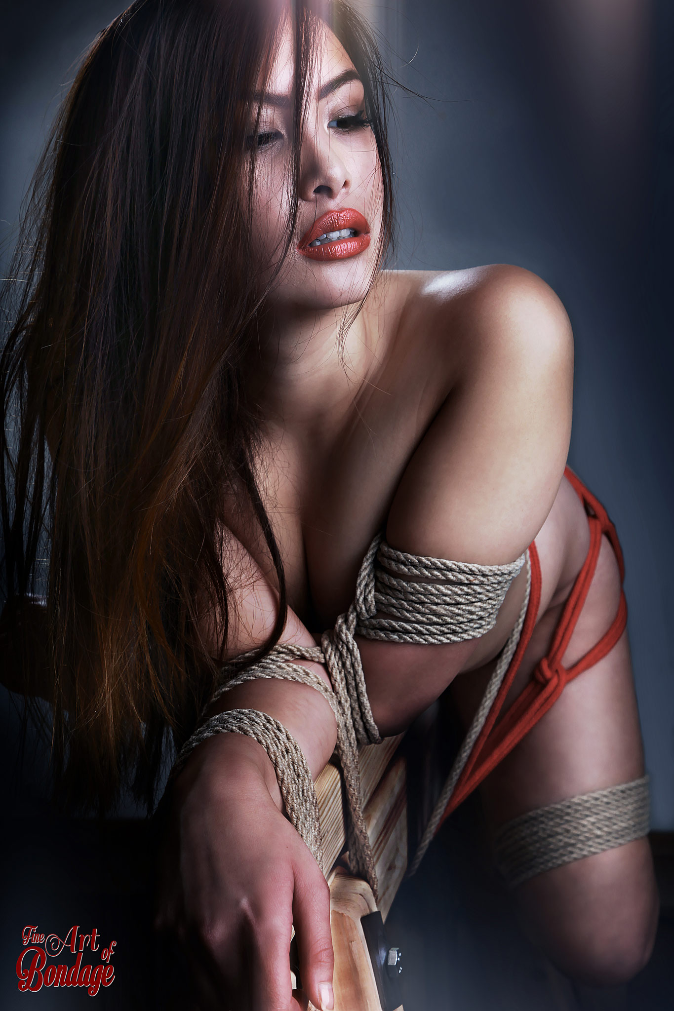
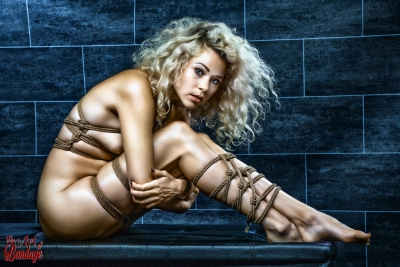
Here´s an example – 2 styles of a beauty, bound to a trestle of wood. The model liked this image and so I did some retouch on it. At the end I had several images and 2 of these where the best. The first in a more natural but colorful style and the second in a much colder color tonal. I tried to get some response in several bondage/bdsm groups on Facebook: About 55% liked the left(natural) design a little bit more than the colder design. So I think both are really good – but it depends on the eye (or mood!?!) of the people watching it…
Bigger sizes of each photo
Actually I tend to use the more natural photo in the book – but I also will publish the other photo on the web too… So everybody can watch his favourite bondage art…
btw: Would be great to get your opinion in the comments…


